SHAPING A BLANK CANVAS
A standard Mono requires only three aesthetic choices – exterior color, interior color and flooring. This simple, blank canvas is the foundation of every DROP Structure.
However, as we’ve grown to meet the desires of our clients, we’ve added countertops, cupboards, showers and sinks, which take up room and start to define the space before it leaves our facility.
To maintain every DROP Structure’s ability to remain a blank canvas for our clients’ visions, we’ve added a custom option for larger units that allows buyers to better define their built-in amenities.
For our clients who choose the custom route, that makes the first choices the most significant. So, it’s essential they’re made well.
That’s where Lisa Abernathy, our new in-house interior decorator, comes in.
“I’m here to help clients finish their canvas,” she said.
Say hi to Lisa
A trained interior decorator and artist, Lisa works primarily with natural materials like fiber, clay and plaster, creating raw, organic pieces inspired by nature.
For the past five years, she’s focused heavily on creation, producing pottery, fiber art and home decor under her company name, Timber and Cord. Recently, she’s chosen to further explore interior decorating and come on board to guide our clients through the custom design process.
We are happy to welcome Lisa to the DROP Structures team and excited to see how she will push our designs forward to embrace new directions, textures and colors.
Helping clients navigate custom design
Once a client chooses to move into the custom space, the buying process becomes more involved as the options move from simple to endless.
“Clients choose to work with me because they get to move into different areas of design,” Lisa said. “Then, the sky is the limit, really.”
Guided by Lisa’s understanding and knowledge, the client is free to define the palette and texture of the space by pulling in brands and companies that inspire them. This way, the space has the client’s design baked in from the very beginning of construction.
But, for Lisa, the interior design process is about so much more than picking and choosing. It’s as much about what she doesn’t do, as what she does.
“It’s very important for me to allow clients space to take up room – to have their own voice in the design,” Lisa said.
Instead of taking over design and pushing her aesthetic on clients, she comes alongside them, showing them options and opening up new possibilities. This creates a canvas ready to complement their vision for how the space should look, feel and perform.
From blank canvas to dreams of Palm Springs
Our clients have never had a chance to dream as big as they can today. From writing hut to short-term living, our structures offer more options with more opportunities to encapsulate a greater range of visions.
To demonstrate the new possibilities, and allow us to spotlight Lisa’s design skills, we gave her a blank slate of her own, in the form of the new Mono+.
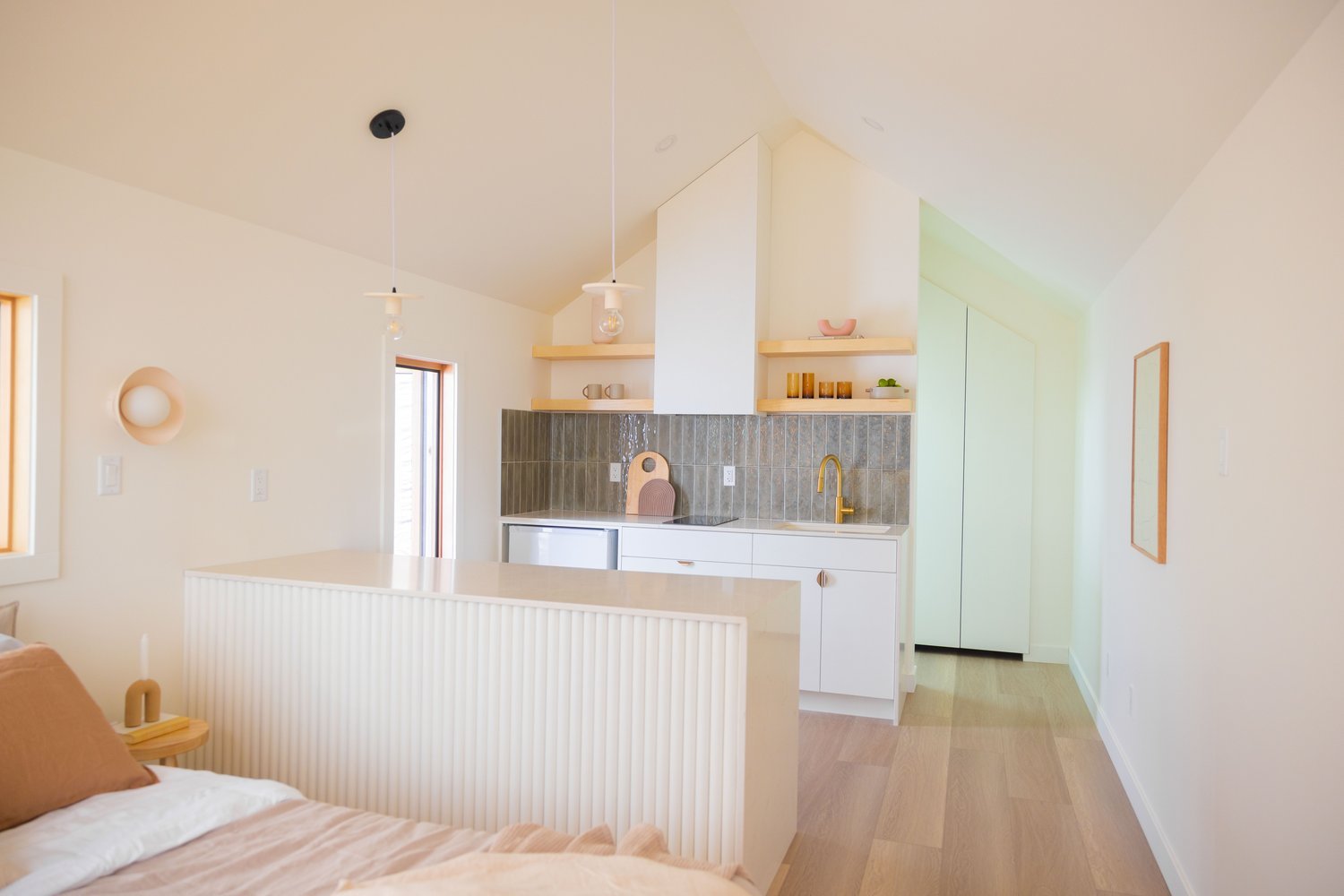
Lisa chose to outfit the structure as a short-term stay cabin with a fresh, beach-meets-desert atmosphere.
The design and living area center around the kitchen, where the tile backsplash draws the eye, creating visual weight in an otherwise open, airy space. Because the Mono+ doesn’t have a bedroom, Lisa created a sleeping space up front, where the morning sun can gently wake sleepers. In the back, bathed in sunlight courtesy of a skylight, there’s a custom bath with bright tiles and a glass shower that continues the open feeling of the rest of the unit.
It’s a light, bright oasis fit to escape the southern Californian summer heat.
Decor
Usually, Lisa leaves the decor up to the client, including furniture like the stools and bed. However, because this Mono+ is her introduction, Lisa had full creative control to outfit it to match her vision.
Leaning on a palette of dusty roses, desert browns and bright whites, Lisa pulled both from her own collections along with easily accessible online stores to populate the space.
Drawing from the rawness of nature
Lisa’s inspiration for her Mono+ comes from two major elements:
The beauty of imperfection
Organic shapes and textures
This idea seamlessly overlaps with the clients she works with too.
“What's so beautiful in people and in their stories and in their processes is that it’s so perfect because it’s not perfect,” Lisa said.
Harmonizing with those notes of nature and humanity, Lisa plays with the natural flaws and raw shapes and textures to bring a sense of ‘perfect imperfection’ to a space.
Balancing vision and design
As we grow beyond the simplicity of the standard Mono, our ability to balance our vision with our clients’ dreams becomes more difficult. Bringing on Lisa as our in-house decorator helps us rise to the challenge.
Together with our clients, Lisa is hoping to define a new standard by enhancing our design – and our vision.
Companies Lisa used in this Mono+ design:


